Fathom Summer Series
My Process
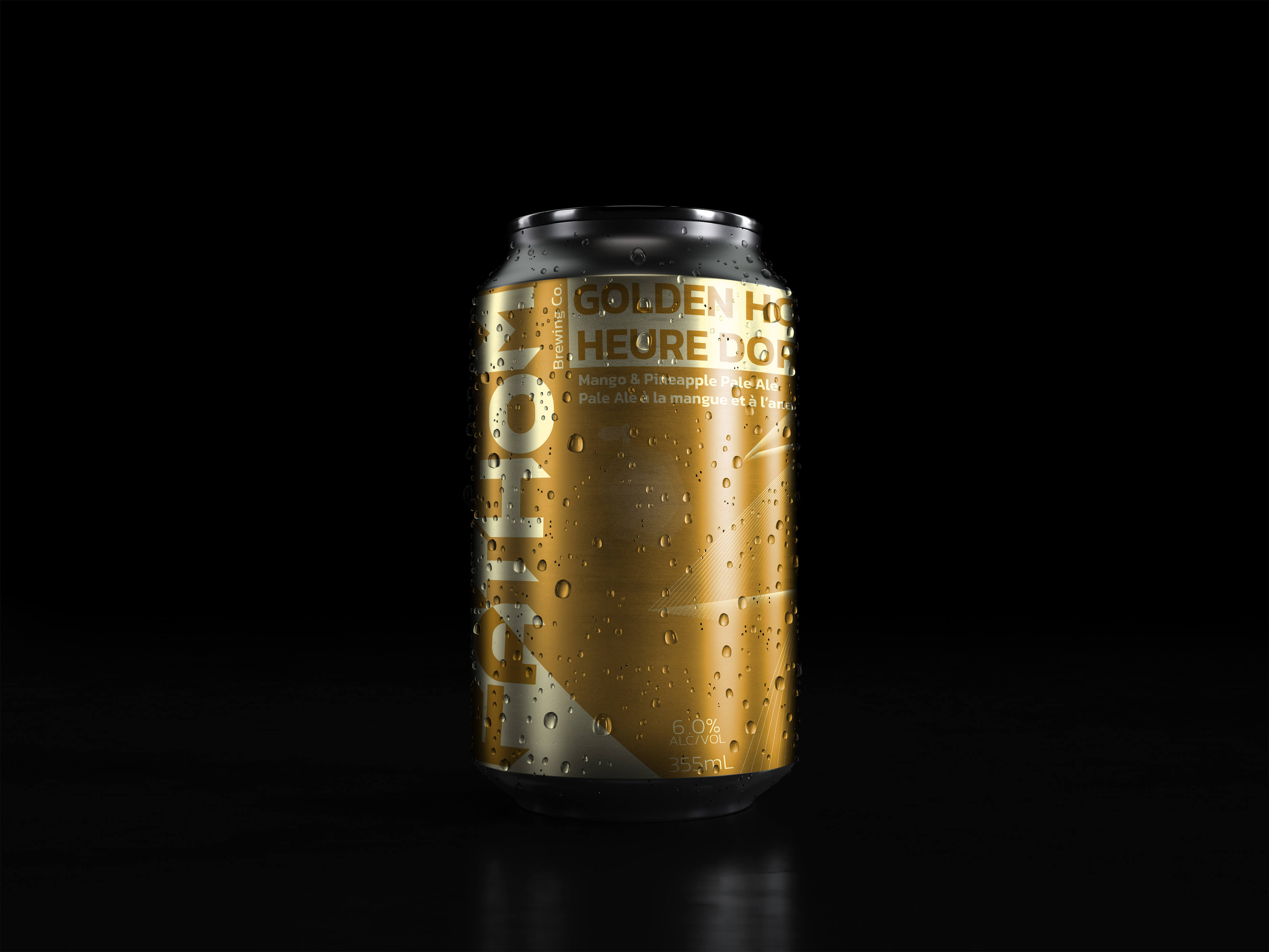
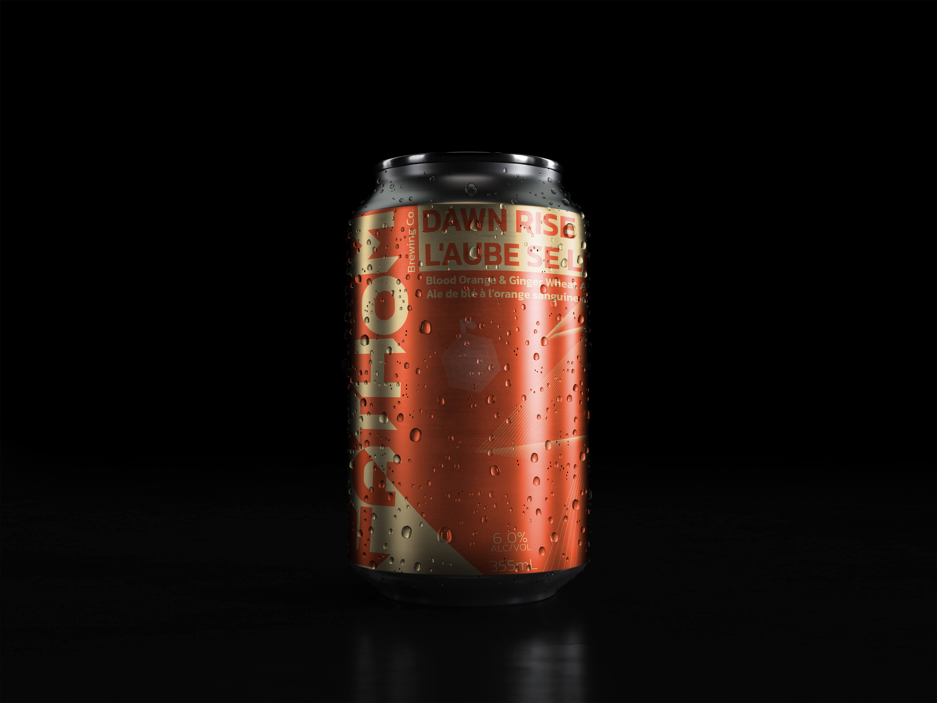
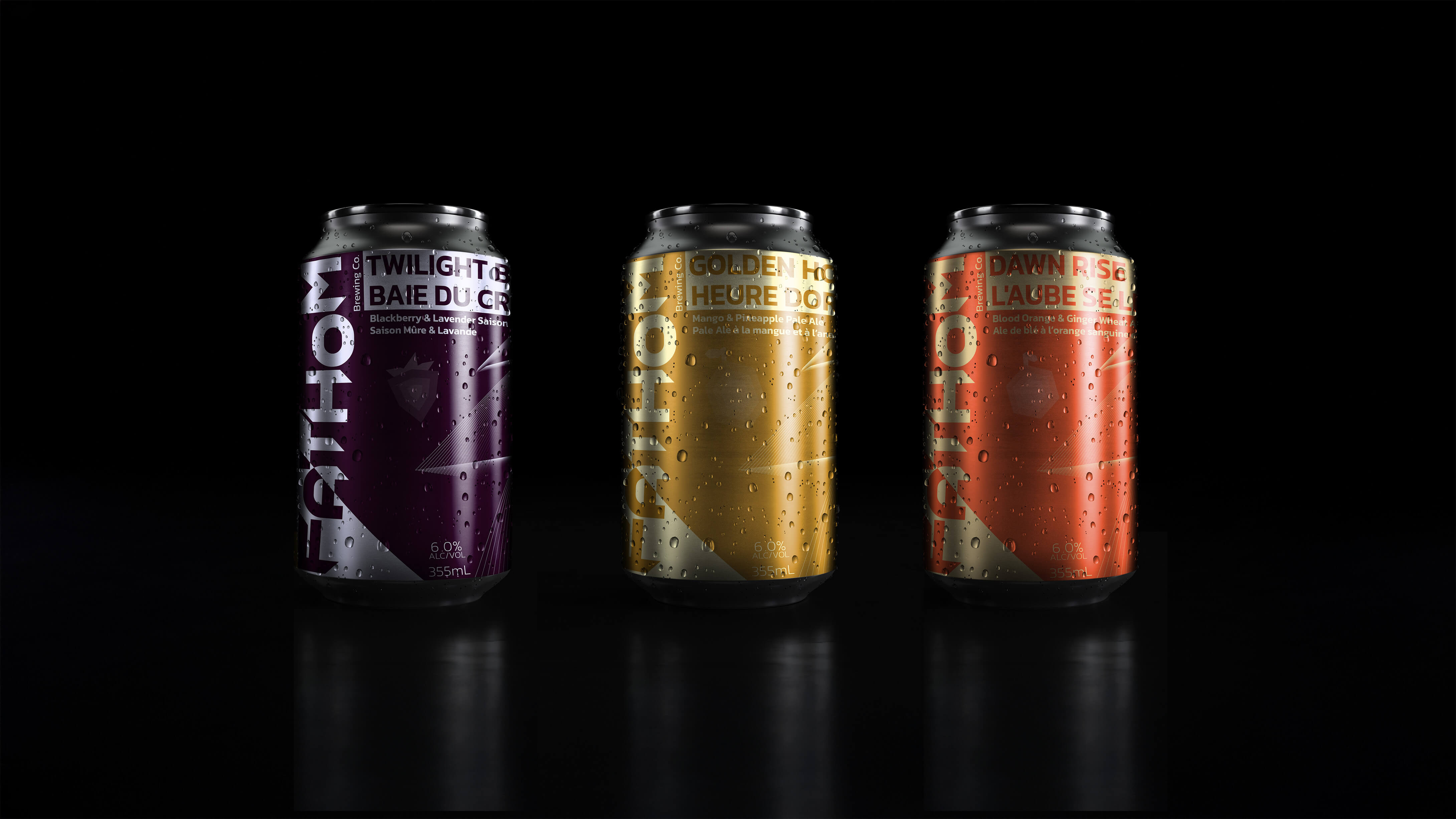
The Fathom Summer Series was created to capture the essence of summer through a line of craft beers, each inspired by a distinct time of day. Designed for Canadian consumers, the series balances vibrant visuals with bilingual labeling to meet packaging standards while reflecting the adventurous, geometric identity of the Fathom brand.
Bold, Geometric Design
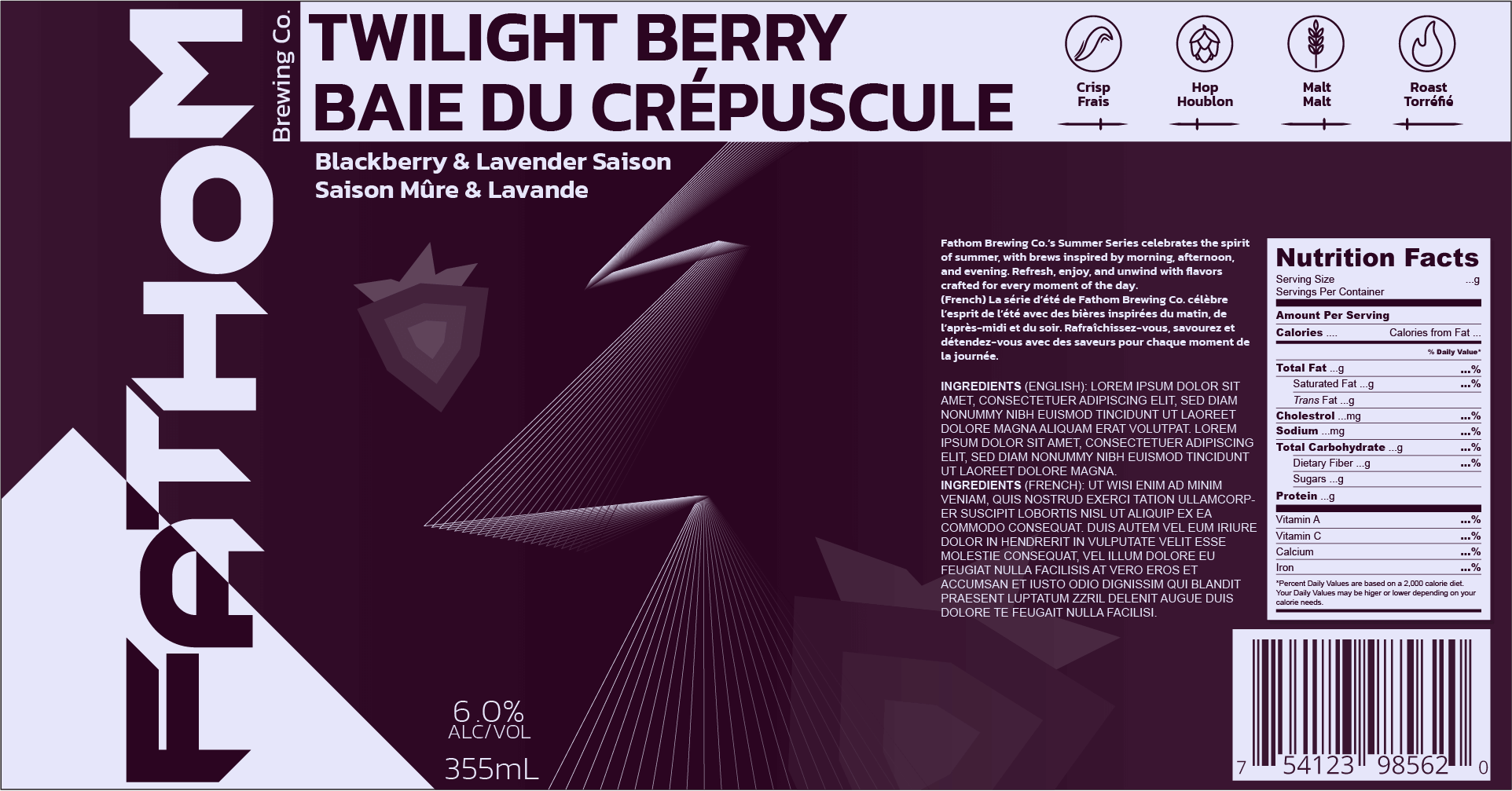
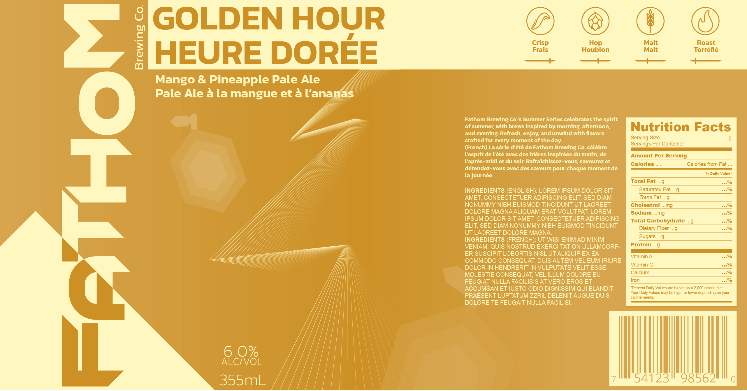
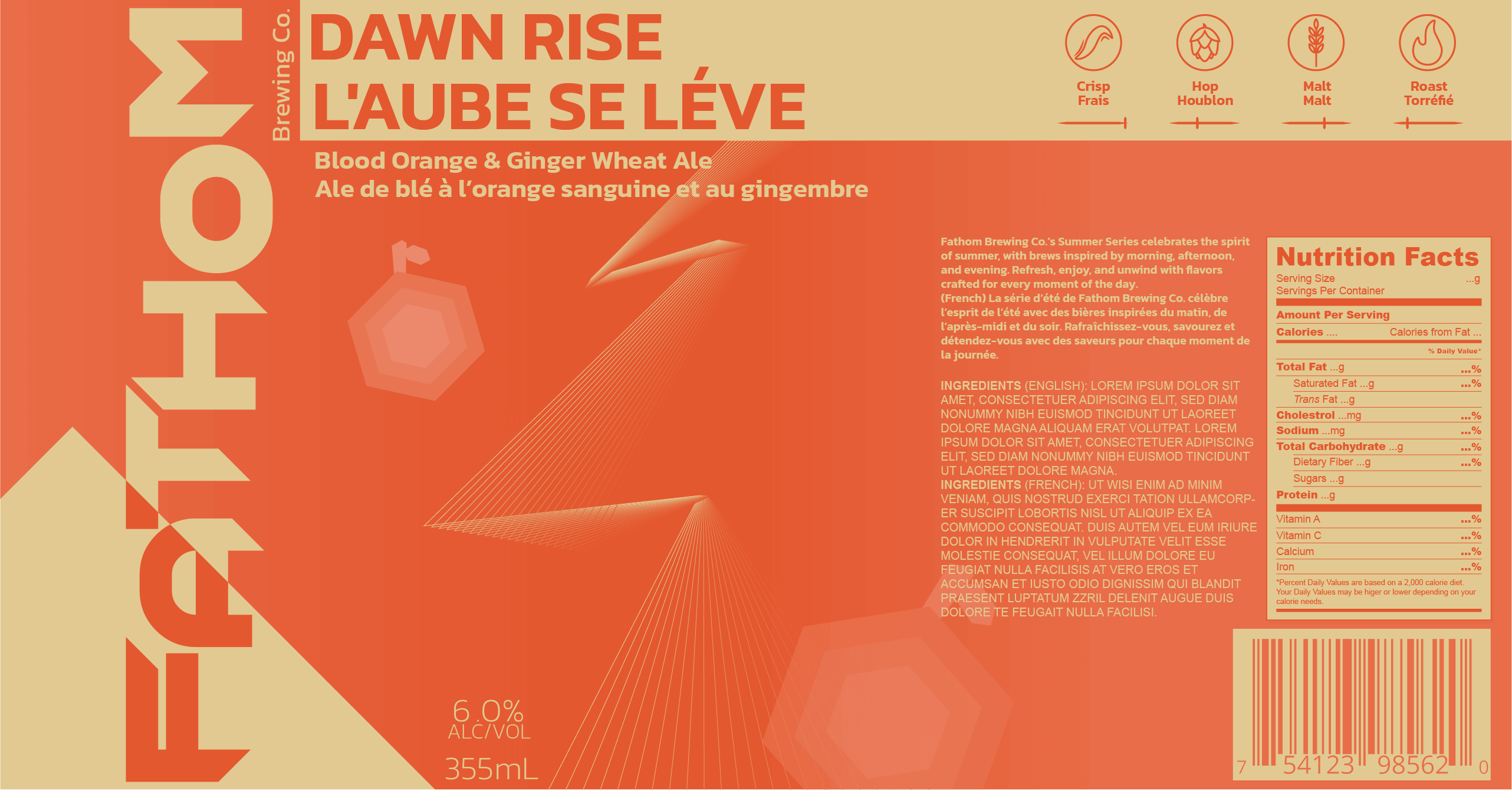
Each can features sharp, geometric fruit illustrations that align with Fathom’s brand style, emphasizing clean shapes and bold lines. Brand cohesion is maintained through this consistent aesthetic, with a unifying line graphic tying the series together.
Flavours Inspired by Summer
- Dawn Rise (Blood Orange & Ginger Wheat Ale) captures the energy of morning.
- Golden Hour (Mango & Pineapple Pale Ale) reflects the brightness of midday.
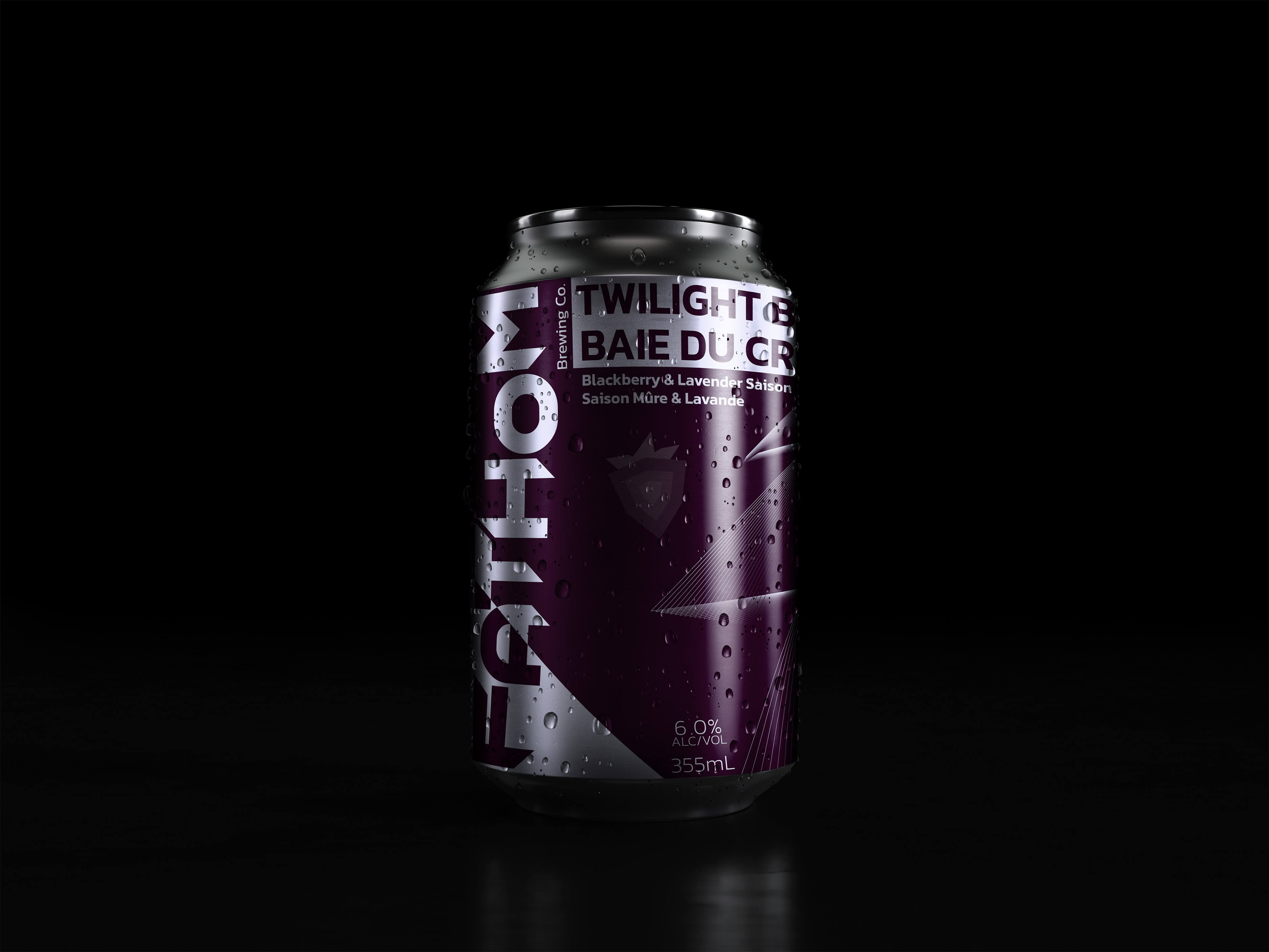
- Twilight Berry (Blackberry & Lavender Saison) evokes the calm of twilight.
Custom Iconography
Icons highlight key flavour profiles like crispness and malt, giving consumers a clear sense of what to expect while adding depth to the design.
Shelf Appeal
With vibrant colors, bold graphics, and a clear story, the Fathom Summer Series stands out on shelves, inviting consumers to experience the adventure of summer through Fathom’s unique lens.
Year
2024
Tools